Microsoft has updated the icons used in File Explorer to be the new Fluent icons, and while they look great, there is a tradeoff between design and functionality.
Microsoft announced last year that they were beginning a process of migrating the existing Windows 10 icons to their Fluent design system, which is supported in Windows, iOS, Android, and web applications.
As a teaser, Microsoft released an image that illustrates the new Fluent icons coming to Windows 10.
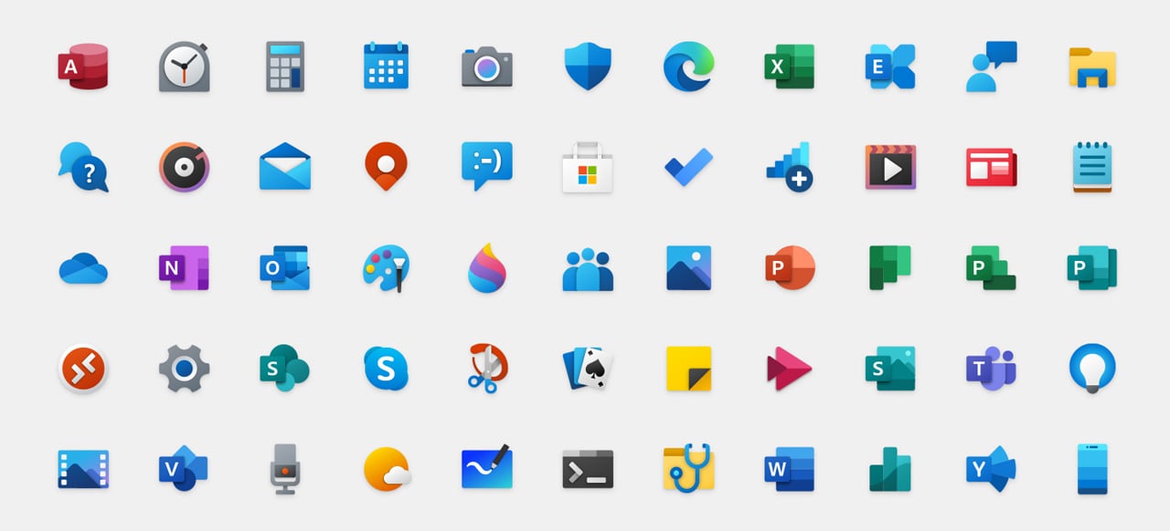
Some of these icons, such as Calendar, Mail, File Explorer, Your Phone, and OneDrive, have already made it into the public releases of Windows 10.
New File Explorer Fluent icons revealed
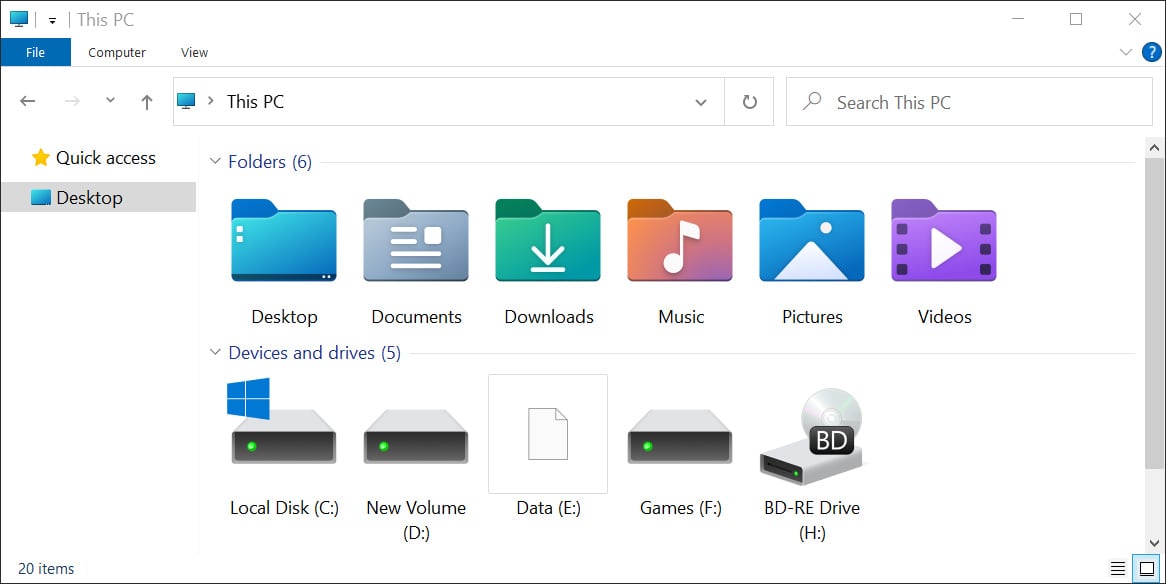
With the release of the Windows 10 Insider build 21343, Microsoft has unveiled their new Fluent Icons for File Explorer that represent drives and the frequently used Desktop, Documents, Downloads, Music, Pictures, and Videos folders, as shown below.
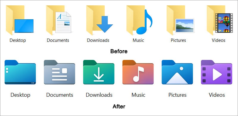
Below you can see a before and after comparison of the existing frequently used folder icons with the upcoming Fluent icons.
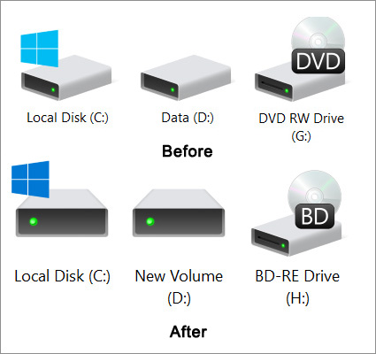
Below are the new File Explorer driver icons coming with the Fluent redesign.
Unfortunately, with a greater aesthetic comes a loss of functionality as the new icons no longer provide a preview of a folder’s contents.
As you can see below, the new Fluent icons use a flat structure that does not offer a preview, while the current icons give a preview of the types of files stored in the folder.
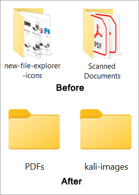
This loss of functionality has not been lost on users who have stated that the folders no longer show previews.
“Those new folders no longer show a preview of the files inside on them. Another functionality removed, MS fanboys rejoice!, ” a user noted on WindowsLatest.


You must be logged in to post a comment Login